Tuesday, 28 February 2012
Feedback Paragraph
Overall I think me feedback was reasonable, there were some things in the feedback which I do disagree with such as the fact that I made lots of spelling errors, and on word there were none, and also that my page numbers do not make sense, when to me they do. To improve my work, I will follow the feedback which I have been given back so that I will have the greatest chance at succeeding in my magazine, the feedback has also given me suggestions as to what I need to do to make it look more aesthetically pleasing.
Monday, 20 February 2012
Thursday, 9 February 2012
Friday, 3 February 2012
Mock-ups
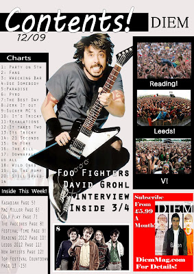
This is a picture of my contents page and i have tried to make it relevent to the type of magazine it is and i have kept to the colour palette which i have assigned myself, however the main picture may be of a different person.
Mock-ups
This is an image of my two page spread design, i have tried to make it relative to the tpye of artist which i am interviewing and this is so that the audience will be interested in it.
Mock-ups
This image is of my front cover it is not a complete representation of what my magazine will look like as i am not good at art, but i have stuck to the ideas which i have taken from my pitch.
Font
For my font i have menttioned in my pitch that i am going to use a 3D font for my title/ masthead, this will be in the style of Slant, this font is relative ot my genre of magazine and will make the masthead stand out. For the general text like my 2 page spread i will use a more formal font like calibri.
Thursday, 2 February 2012
Subscribe to:
Comments (Atom)


